
Campbell Ranch — Property identity concepts
Campbell Ranch is a property developer based in Albuquerque, New Mexico that creates communities with shared infrastructure, while allowing land owners freedom and a ‘blank canvas’ on which to build the homes of their choice.
The identity concepts drew inspiration from regional petroglyphs and Native American culture, forming a modular system designed to grow over time alongside the development.

San Pedro Overlook — Final property identity
A completed identity for a residential development within Campbell Ranch, applying the system at a specific site level while maintaining coherence with the wider brand framework.
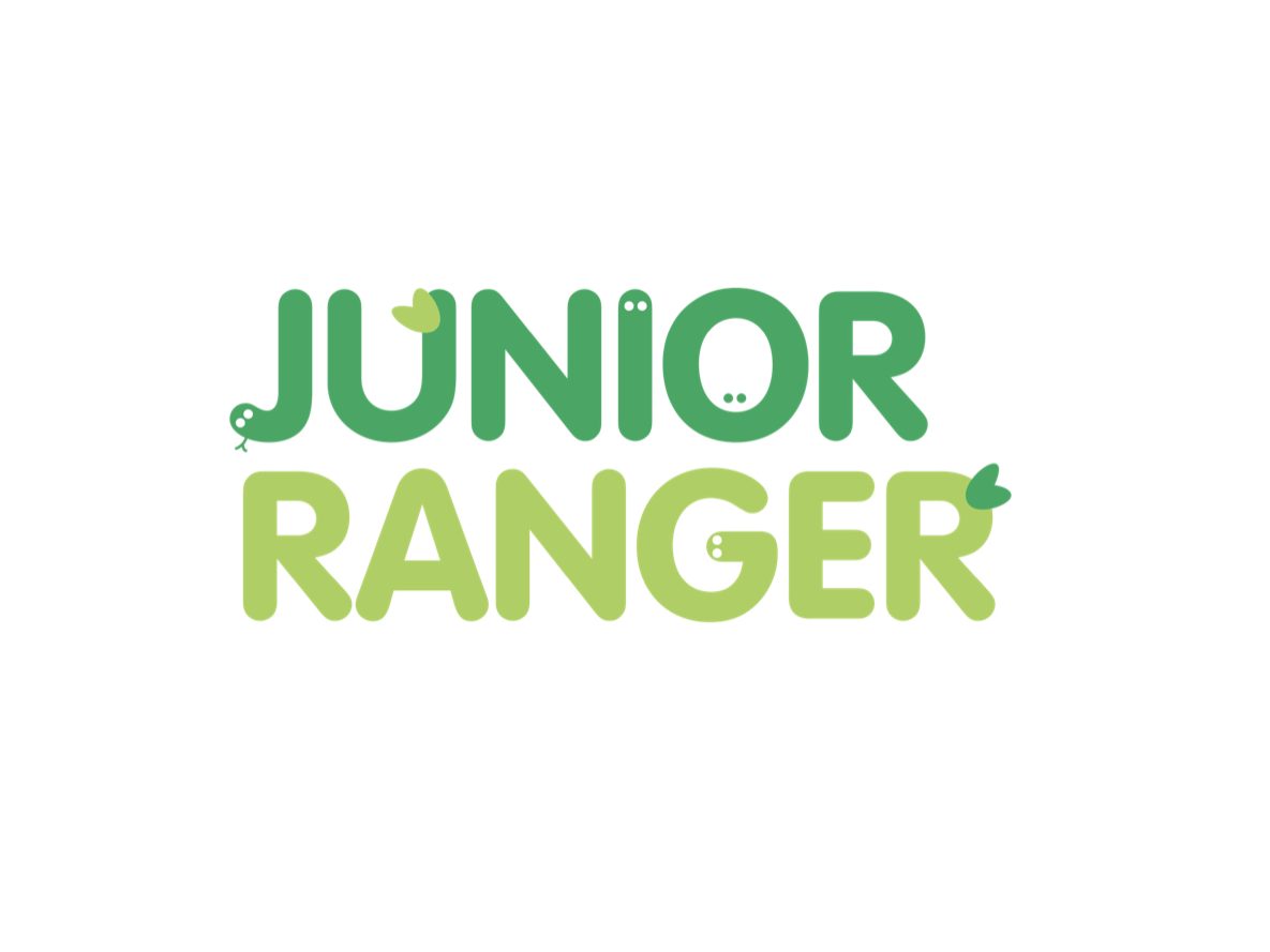
Butlin’s — ‘Junior Ranger’ outdoor activity club
Identity design for a children’s outdoor activity programme, developed to feel playful and accessible.
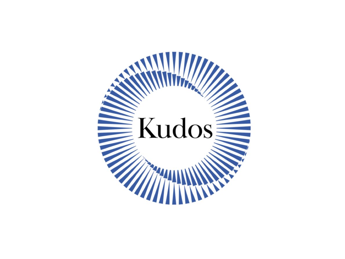
HS2 Design House Consortium — ‘Kudos’ employee engagement programme
Identity for an internal engagement and recognition programme created for the HS2 Design House consortium, involving ARUP, Strabag and Typsa.
The identity centred on a circular motif to express collaboration, shared momentum and collective achievement, and conveyed credibility within an engineering context, combined with typography that aligned with the ARUP visual identity.
Note: the core shape was adapted from stock illustration.
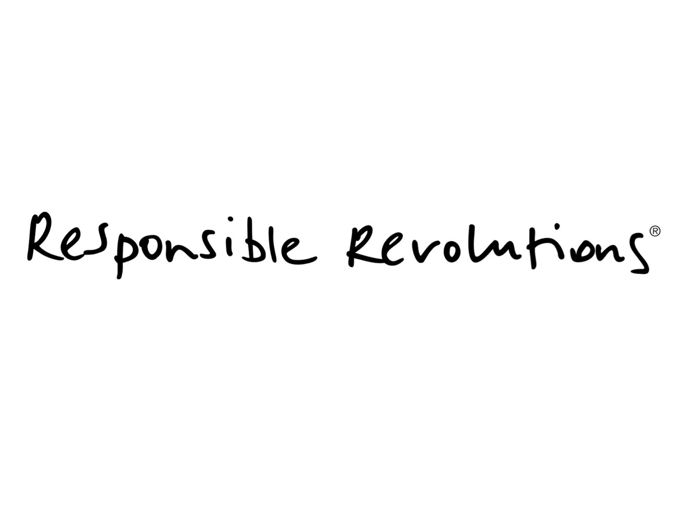
‘Responsible Revolutions’ — Secondary identity mark
An identity developed for DK&A and Design Thinkers Academy London, used as a secondary mark and sign-off across joint communications to articulate shared values around innovation, responsibility and collaboration.
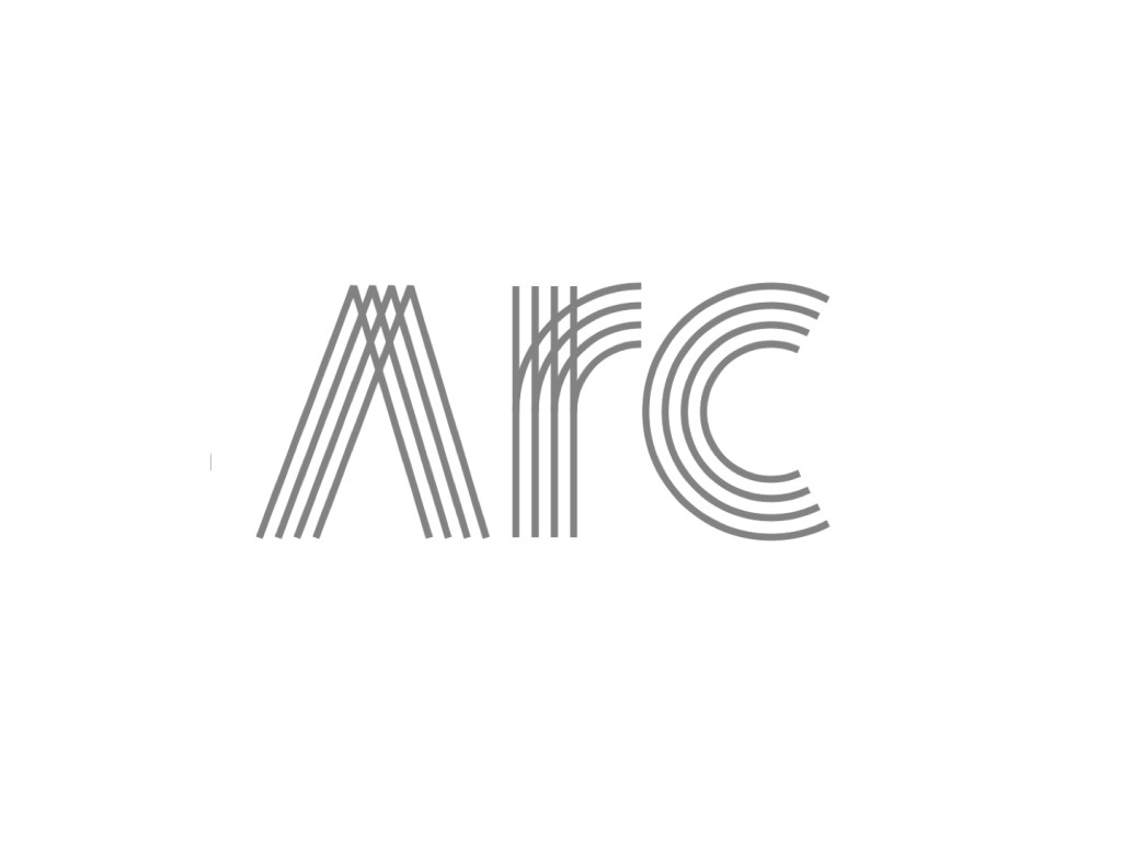
ARCenter — Vernier, Switzerland
Identity for a small commercial development in Vernier, Switzerland. The arc-based ‘A’ form was derived directly from the building’s floor plan, creating a clear connection between architecture and visual identity.
